What’s the best font? – Emi S
Hello – I’m back again with issues that everyone really cares about. Time to rate some fonts.

First off, Calibri, your bog-standard automatically-applied Microsoft font. Honestly, this one’s not too bad, just bit dull. 5/10.

Secondly, a Hodson staple. I change my font to this every time I hand in prep due to fear of unnecessary criticism and aesthetic incongruence. Bonus points for making me feel as if I could actually use half the sophisticated words Mr Hodson casually name drops in lessons. 7/10.
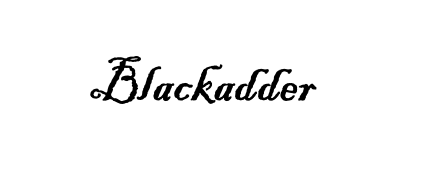
This was my go-to in Year 7 English when pretending I was a character from Great Expectations writing a dramatic letter. Very useful, not illegible, and named after an iconic tv series (probably) – 8/10.

This one’s absolutely grim; there’s an uncanny valley in its attempt to imitate handwriting. 2/10.

This one’s another blast from the past – chemistry teachers were all over this one. Bit too symmetrical though, so I’m not really a fan. 5/10.
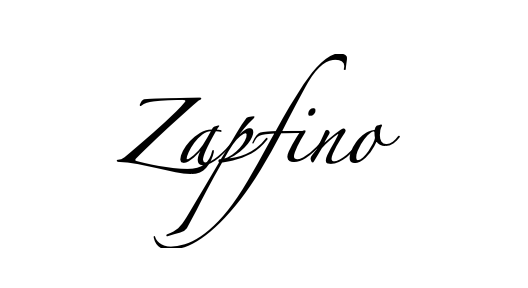
Nice idea, bad execution. Why are the consonants so long? Impractical and inefficient: 4/10.
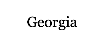
This is my go-to instead of using Calibri. Very legible and the numbers look nice. 8/10.

Finally, the one you’ve all been waiting for: Comic Sans, my beloved. I can’t even tell if I like it ironically anymore – it’s simply iconic. 9/10.




Post Comment
You must be logged in to post a comment.